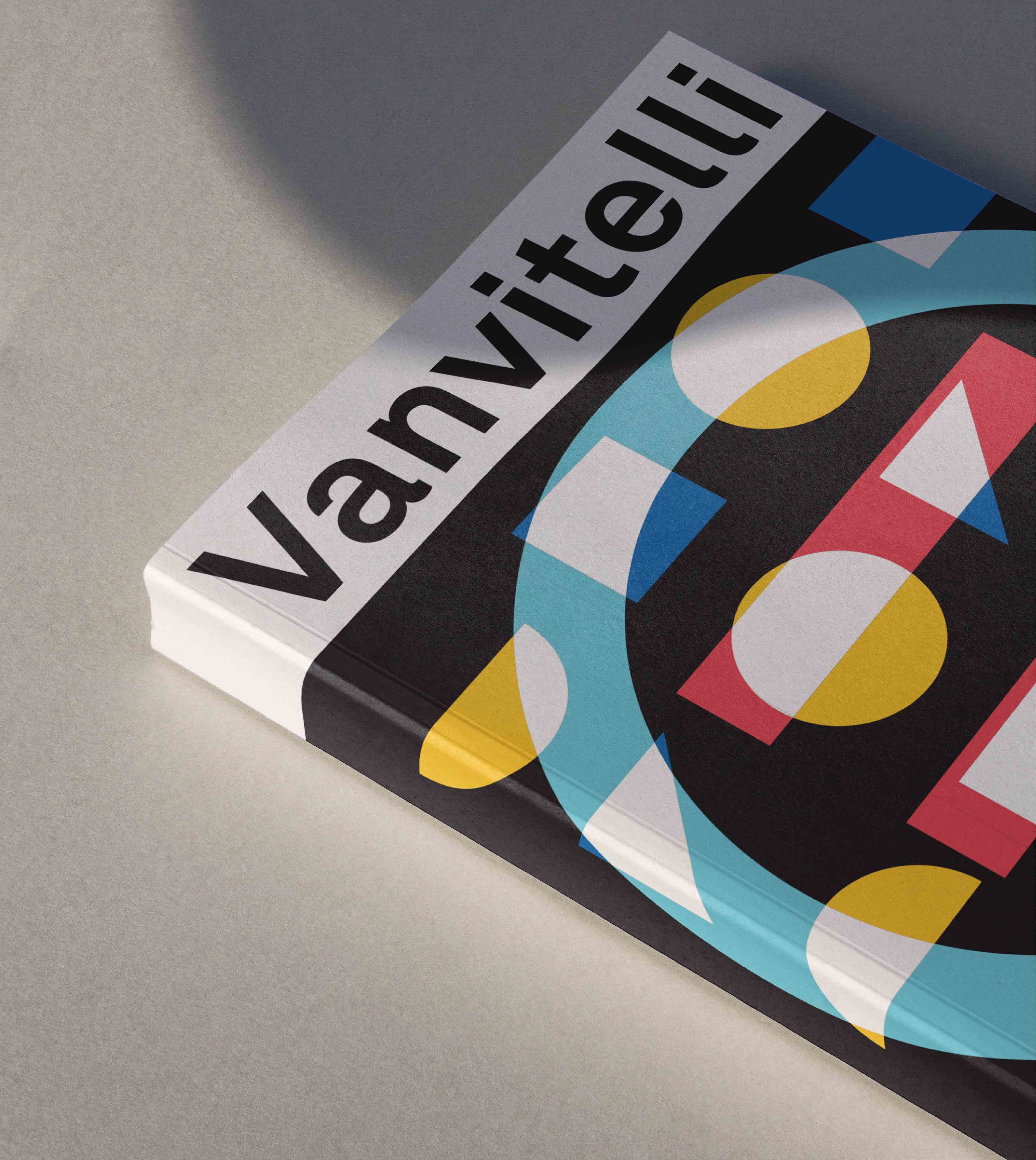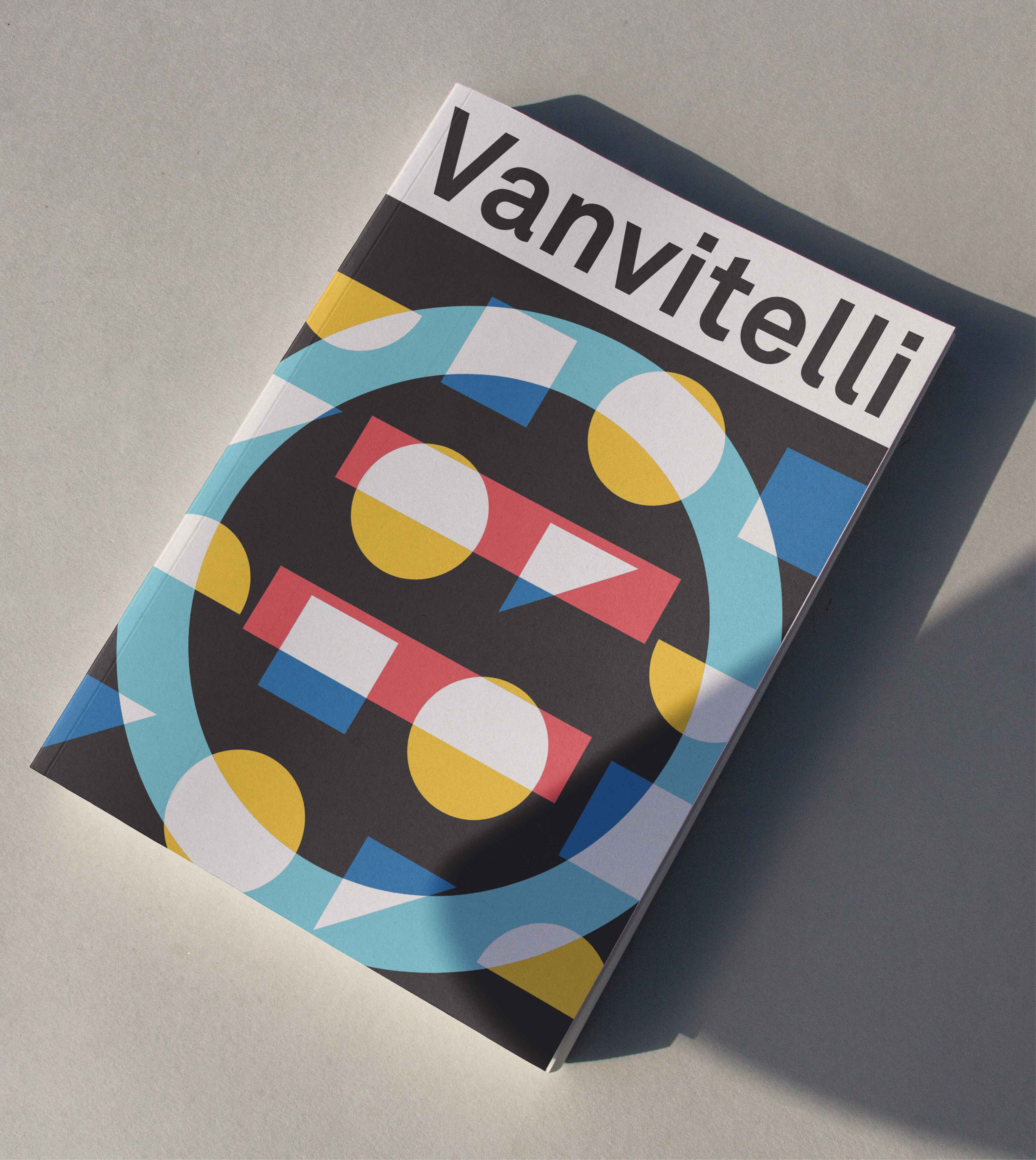
UNIVERSITÀ VANVITELLI
UNIVERSITÀ VANVITELLI
ABOUT
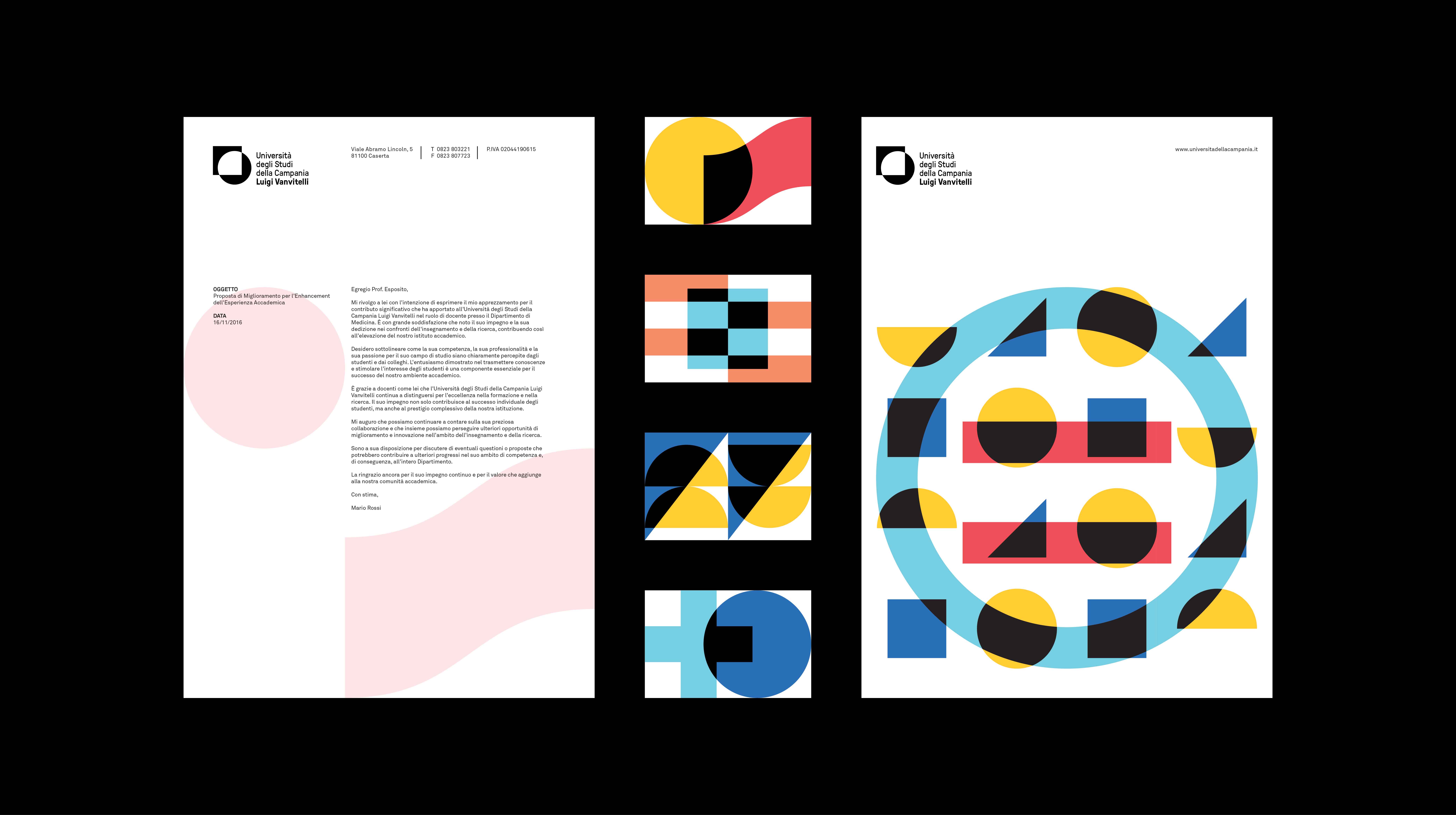
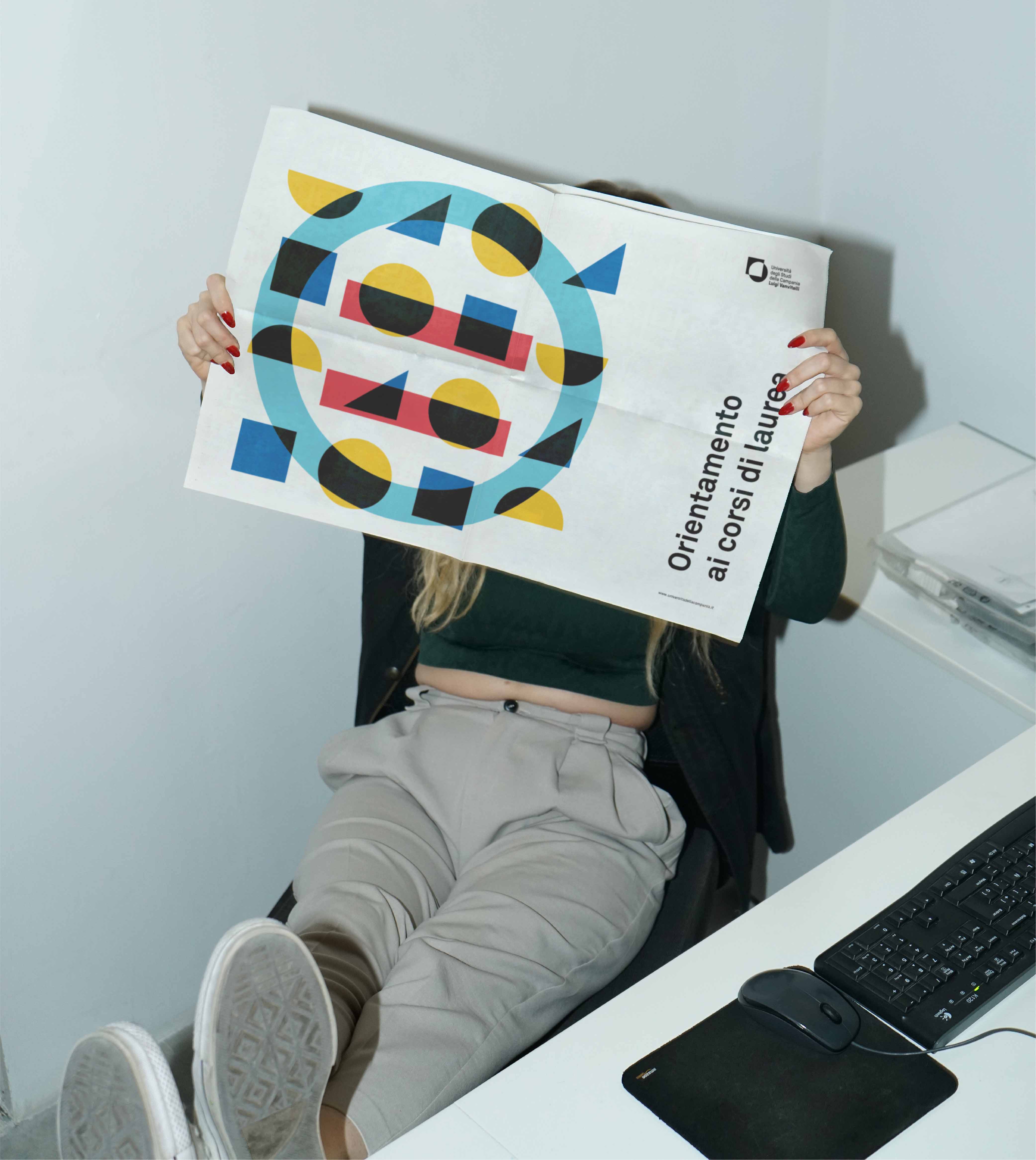
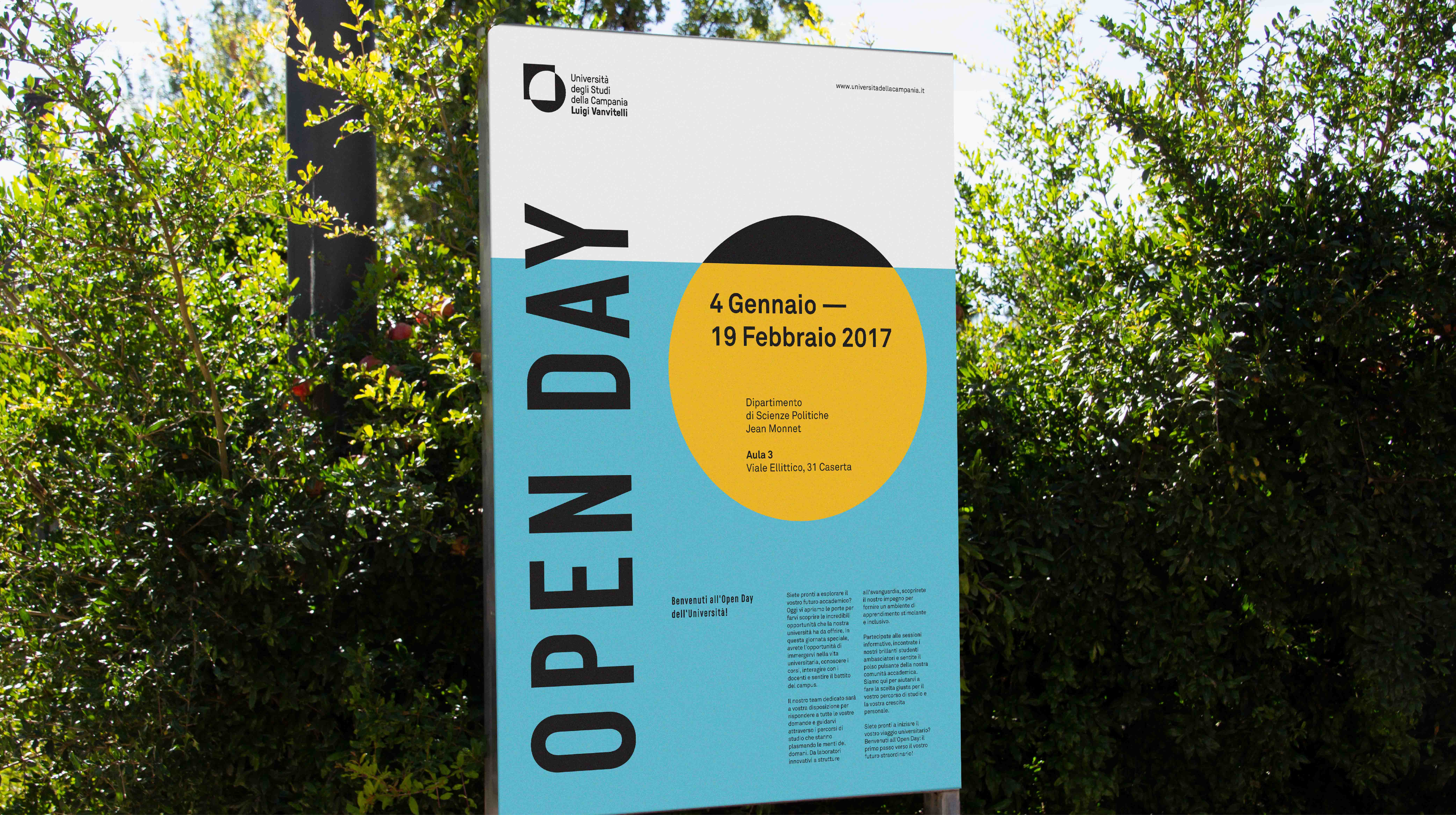
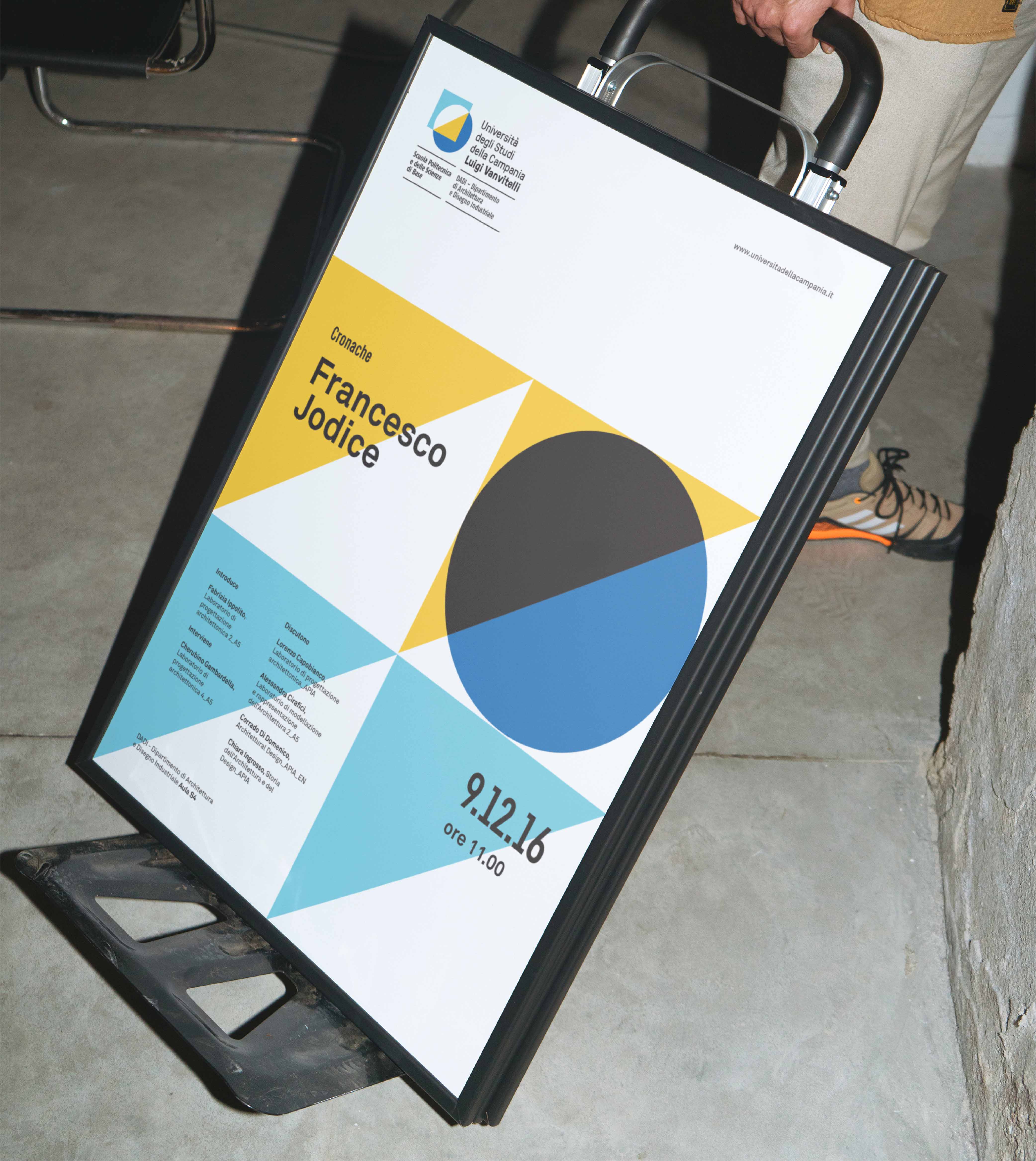
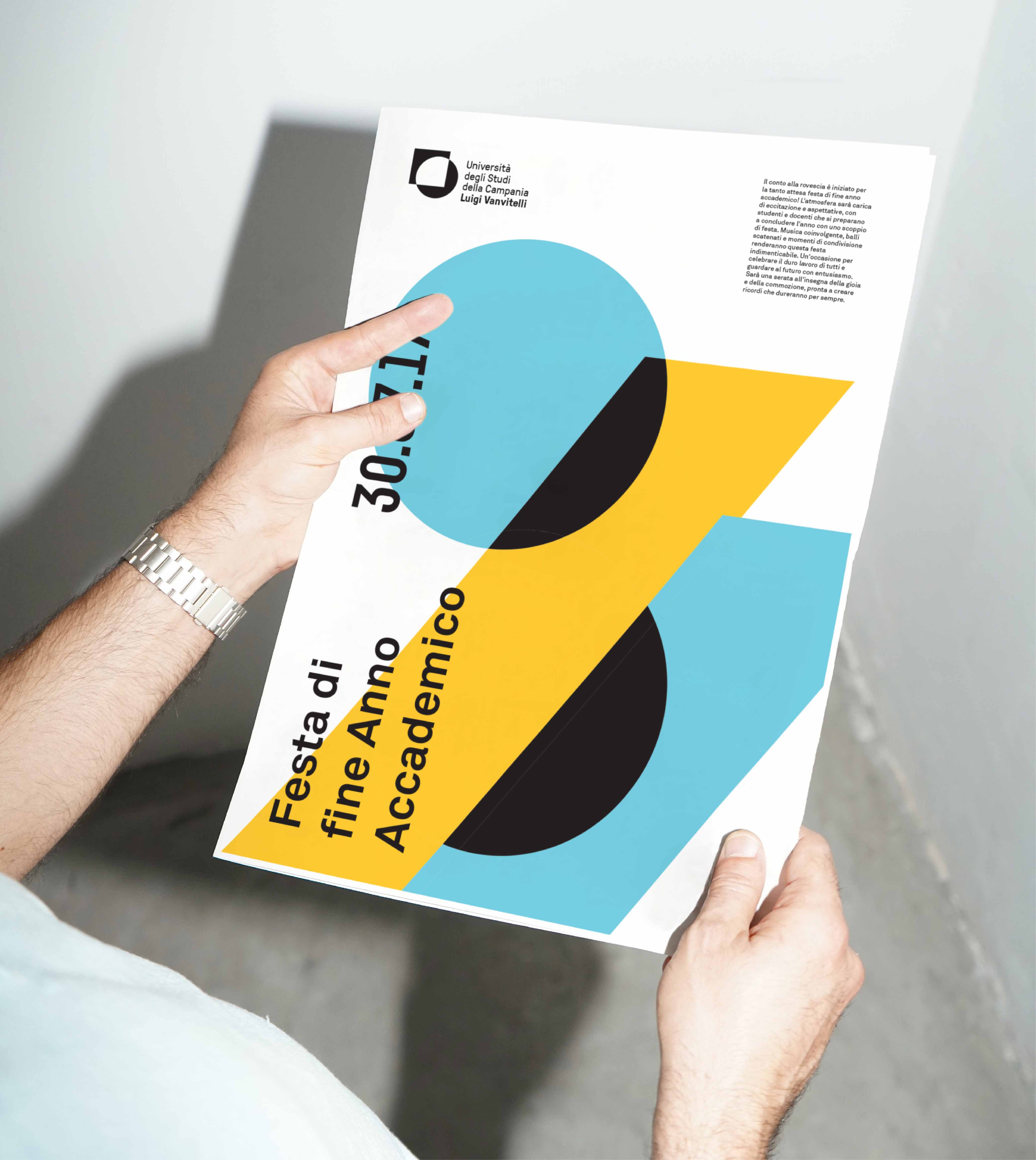
Following the change of the University’s name from Seconda Università di Napoli (SUN) to Università degli Studi della Campania Luigi Vanvitelli, the Institution has decided to launch an international call for ideas to produce the graphic design of the mark and/or logotype and related visual identity system. The University was established in 1991 within a diffuse regional context, and since the very beginning it has been entirely autonomous from the other, older Universities for its history, culture, nature and organisation. The reasons behind the decision to go through a rebranding process lie in the strong will to highlight the University’s modern, highly dynamic nature by: stressing a shift of scale; highlighting the high reputation earned over time; setting the basis for a greater recognisability; reinforcing a renewed, contemporary identity.
CLIENT
Università degli Studi della Campania — Luigi Vanvitelli (Proposal)
DISCIPLINES
Branding, Visual Design, Editorial, Design System
YEAR
2017
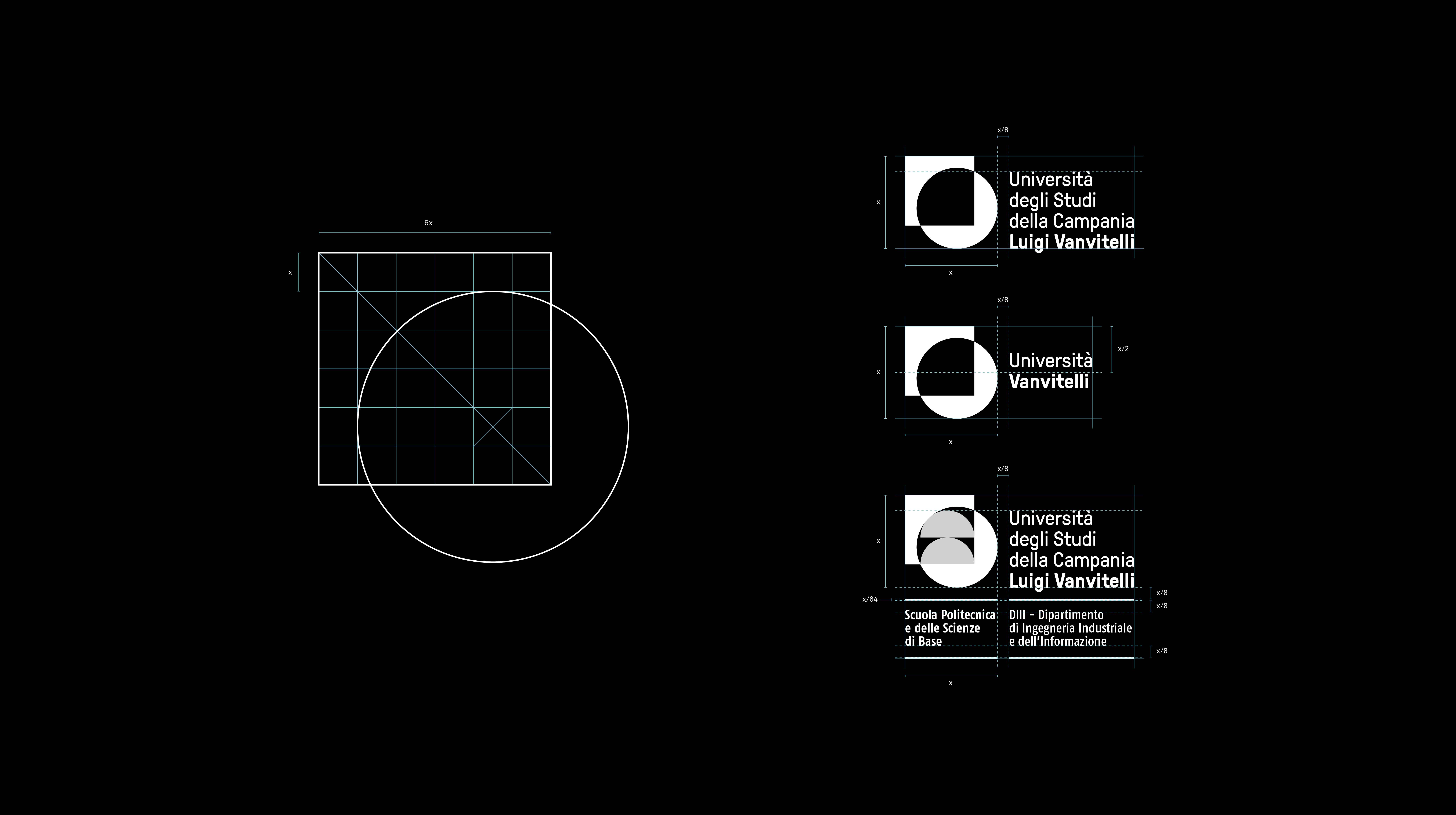
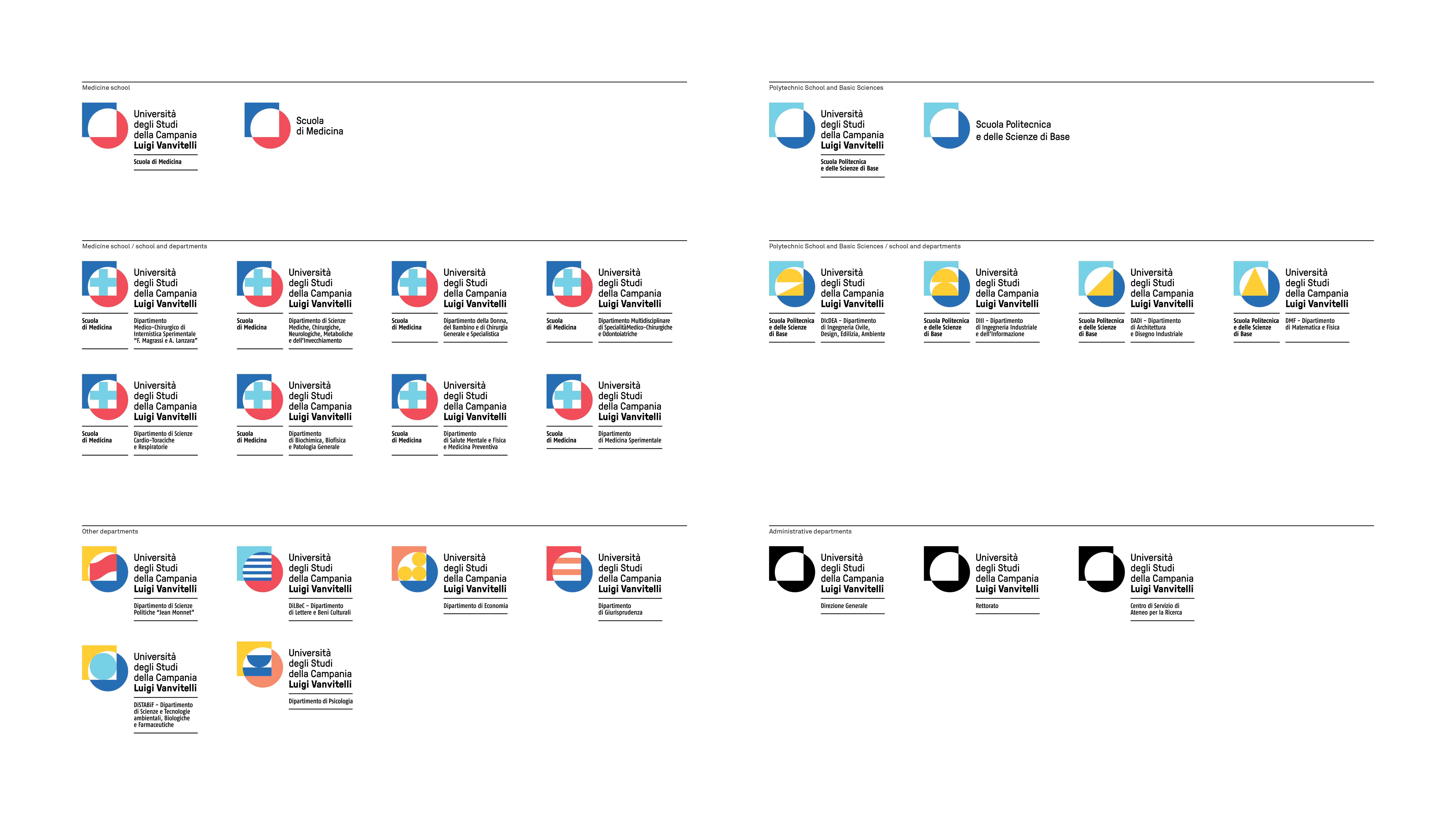
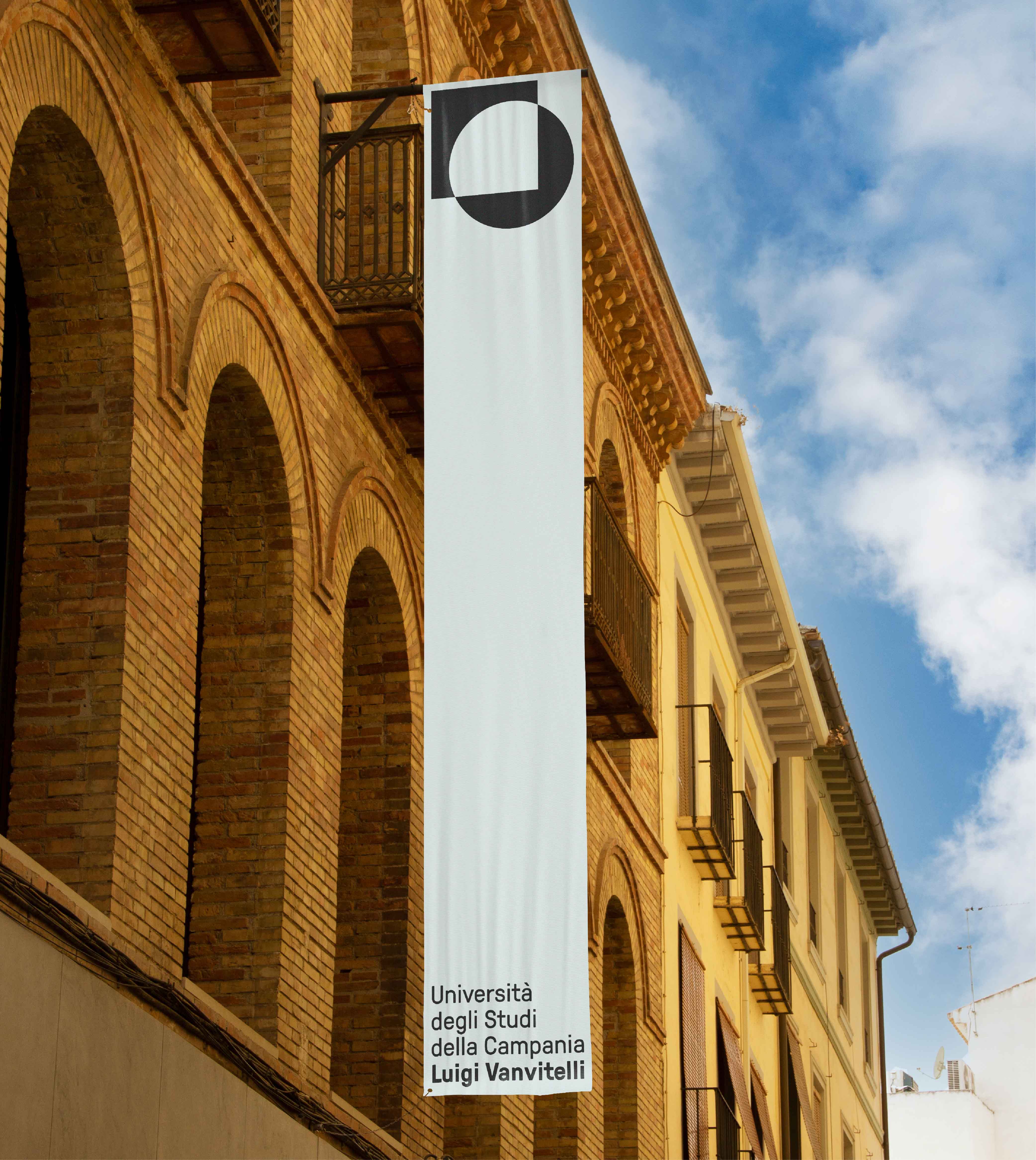
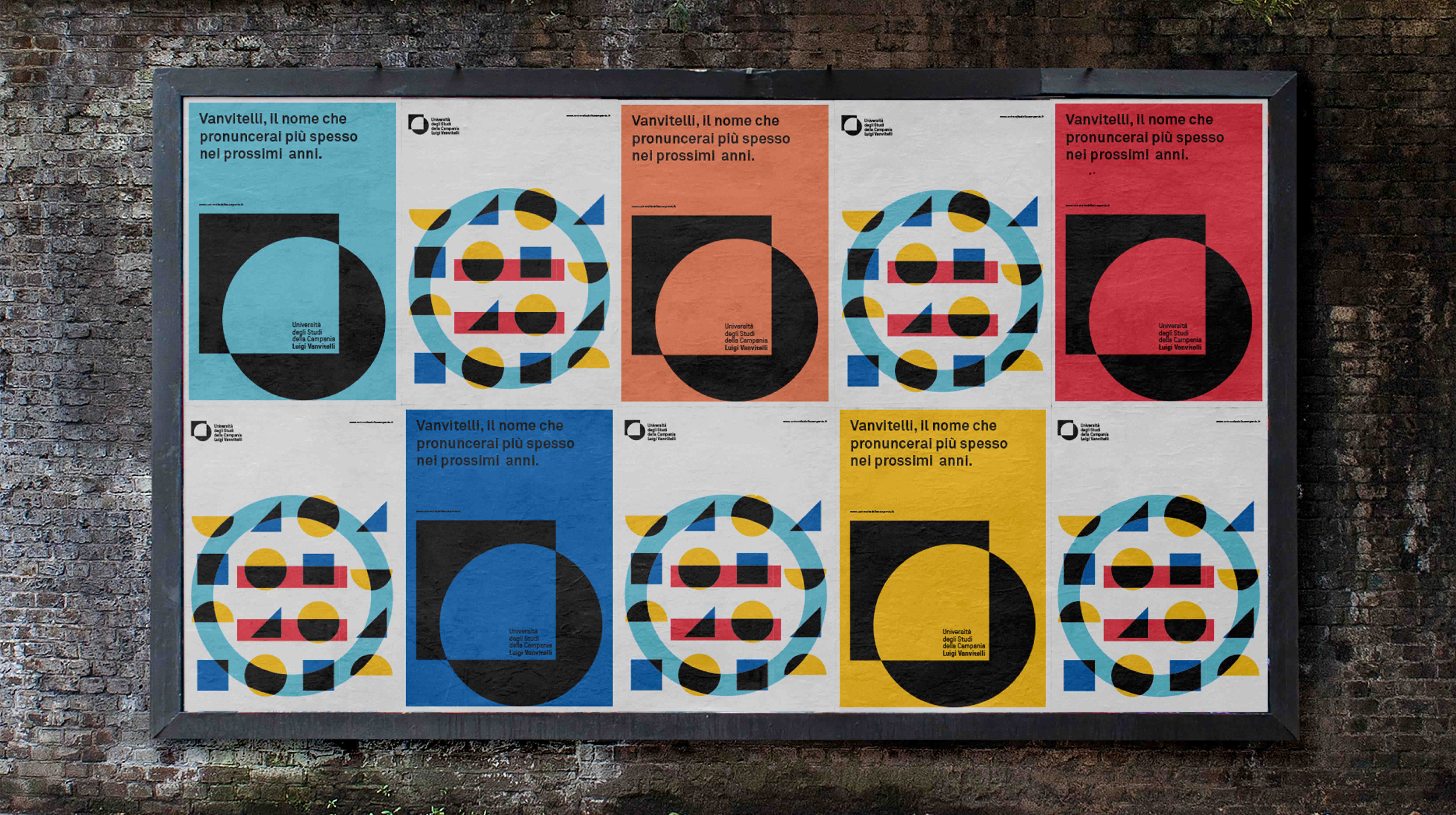
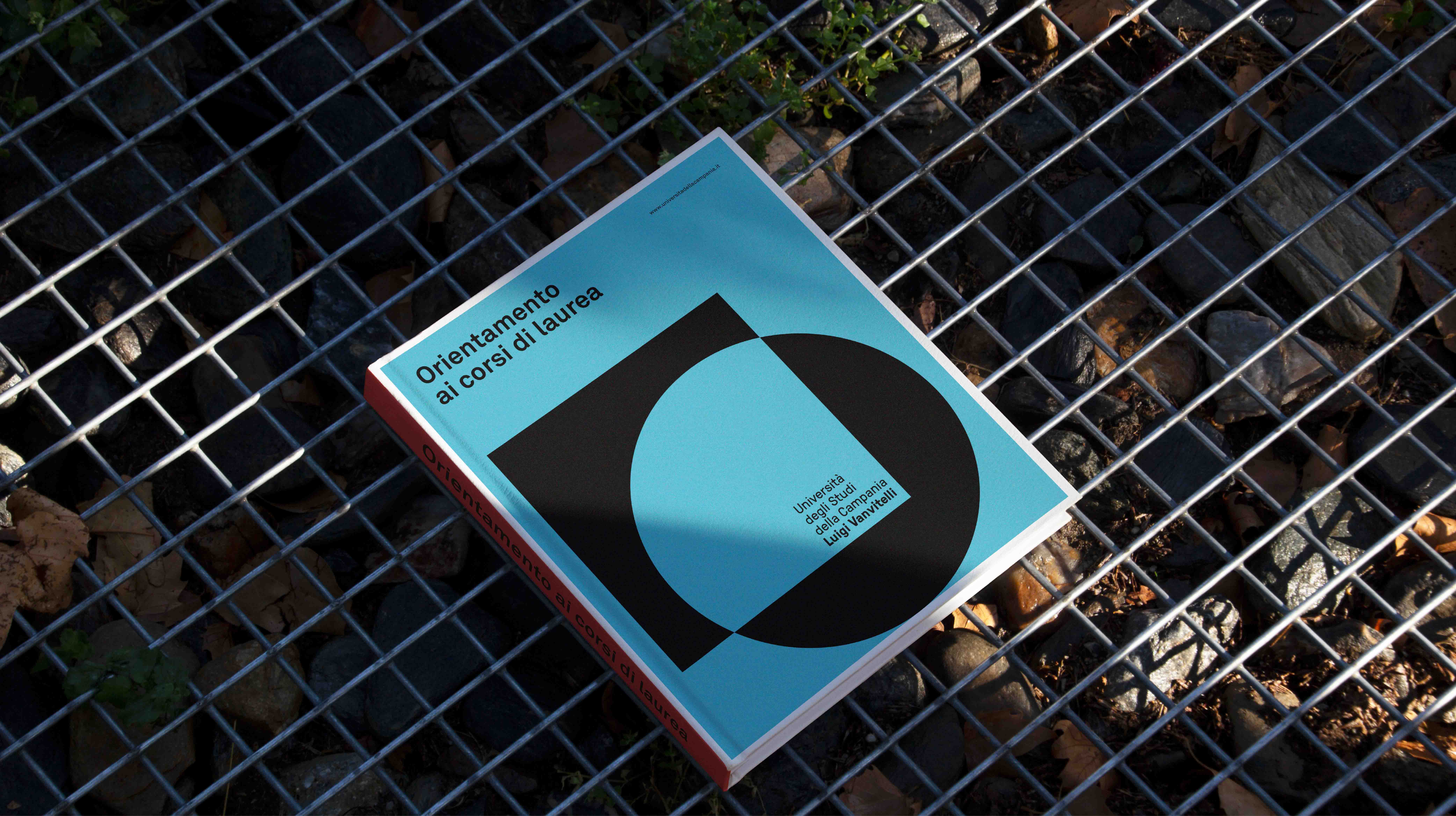
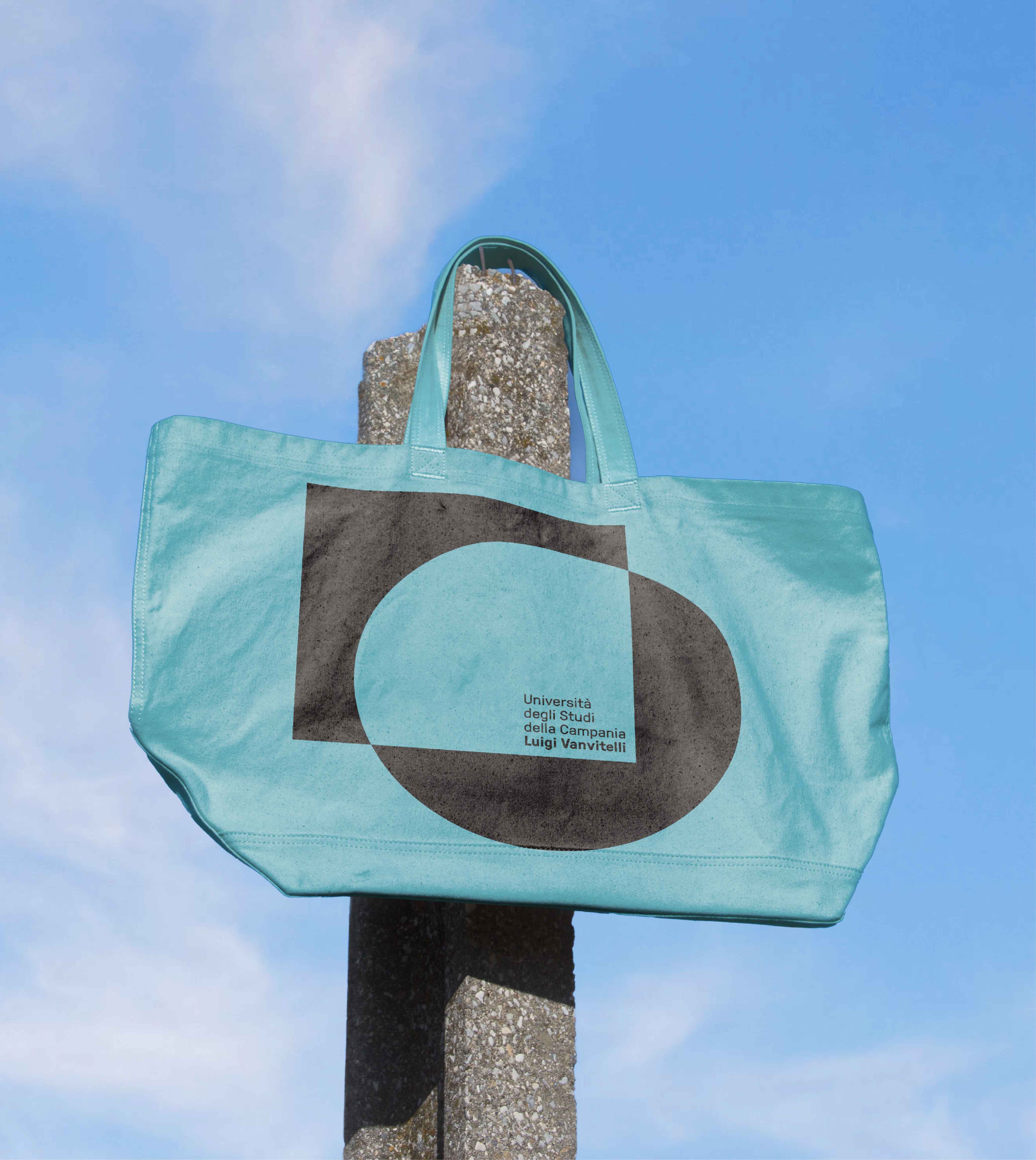
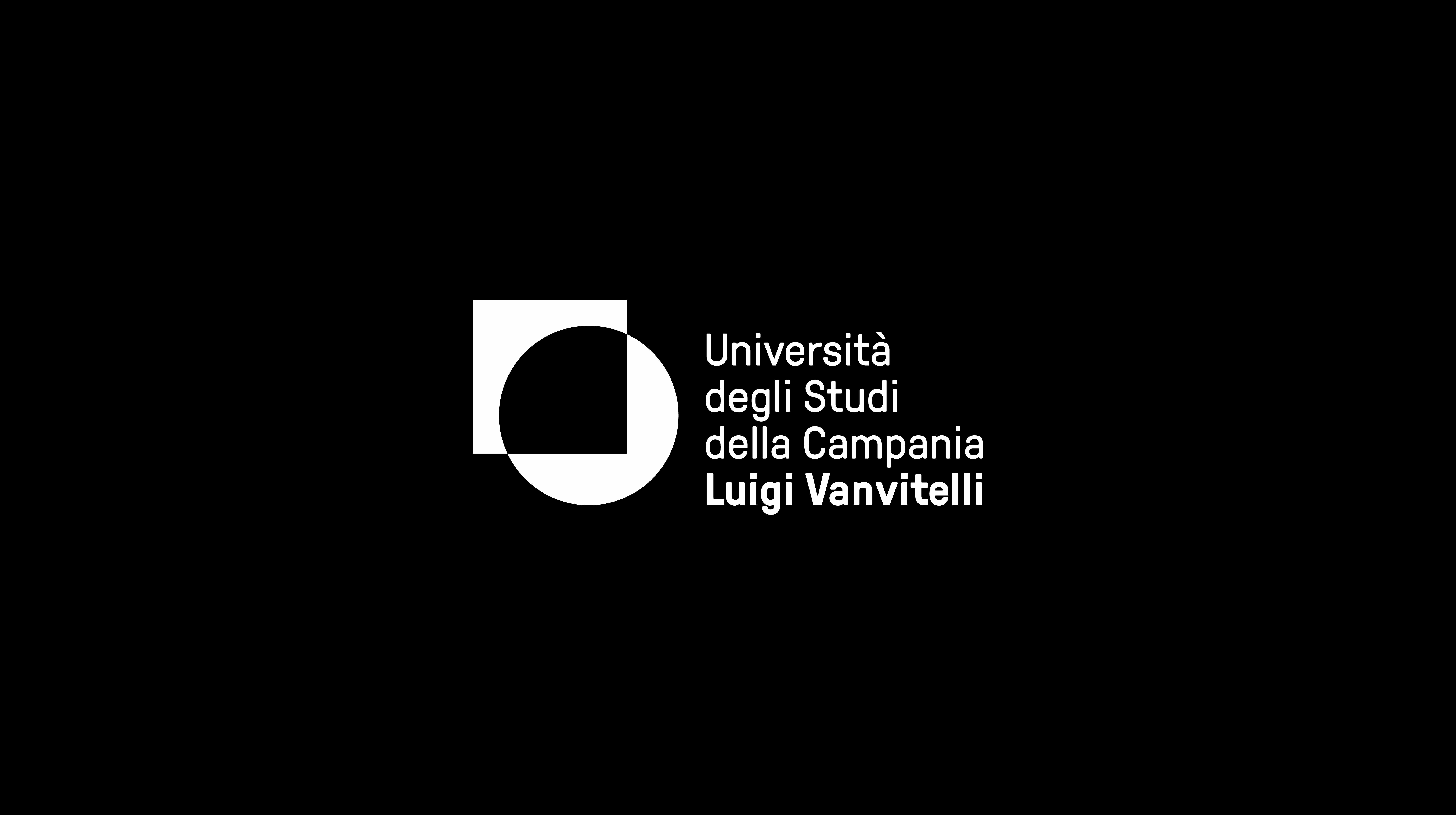
The logo design brief emphasizes three key points: cross-fertilization of knowledge, a sense of community, and multidisciplinarity. The organization, while complying with Ministry requirements, prioritizes relationships based on multidisciplinary and knowledge exchange. The focus on trust-based student-teacher relationships is rooted in open dialogue and inclusive, empathic connections. The university's cultural approach centers on dialogue between scientific research and humanities. The proposed logo combines a circle and square, symbolizing the essence of these concepts.
The logo design brief emphasizes three key points: cross-fertilization of knowledge, a sense of community, and multidisciplinarity. The organization, while complying with Ministry requirements, prioritizes relationships based on multidisciplinary and knowledge exchange. The focus on trust-based student-teacher relationships is rooted in open dialogue and inclusive, empathic connections. The university's cultural approach centers on dialogue between scientific research and humanities. The proposed logo combines a circle and square, symbolizing the essence of these concepts.
