UNIVERSITÀ VANVITELLI
UNIVERSITÀ VANVITELLI
CLIENT
Università degli Studi della Campania — Luigi Vanvitelli (Proposal)
ABOUT THE CLIENT
The University of Campania Luigi Vanvitelli, formerly known as Seconda Università di Napoli (SUN), was established in 1991 and is located in the Campania region of Italy. The institution has a strong reputation for its commitment to academic excellence and a distinctive, independent identity within the Italian higher education system. Over time, the University has become known for its innovative approach, autonomy, and its emphasis on collaboration across disciplines. This rebranding process aims to modernize the University’s identity and highlight its dynamic nature on the global stage.
BRIEF
With the change of its name, the University sought to develop a new visual identity that reflects its modern, progressive ethos while maintaining its strong academic foundations. The rebranding brief emphasized three key themes: the cross-fertilization of knowledge, a strong sense of community, and multidisciplinarity. These principles are core to the University’s approach, which prioritizes collaborative relationships between students and faculty, fostering trust through open dialogue and inclusive, empathetic connections. Furthermore, the institution’s cultural philosophy underscores the dialogue between scientific research and the humanities, which is integral to its educational and research practices. The challenge was to design a mark that visually communicates these concepts while aligning with the University's forward-thinking and dynamic nature.
SOLUTION
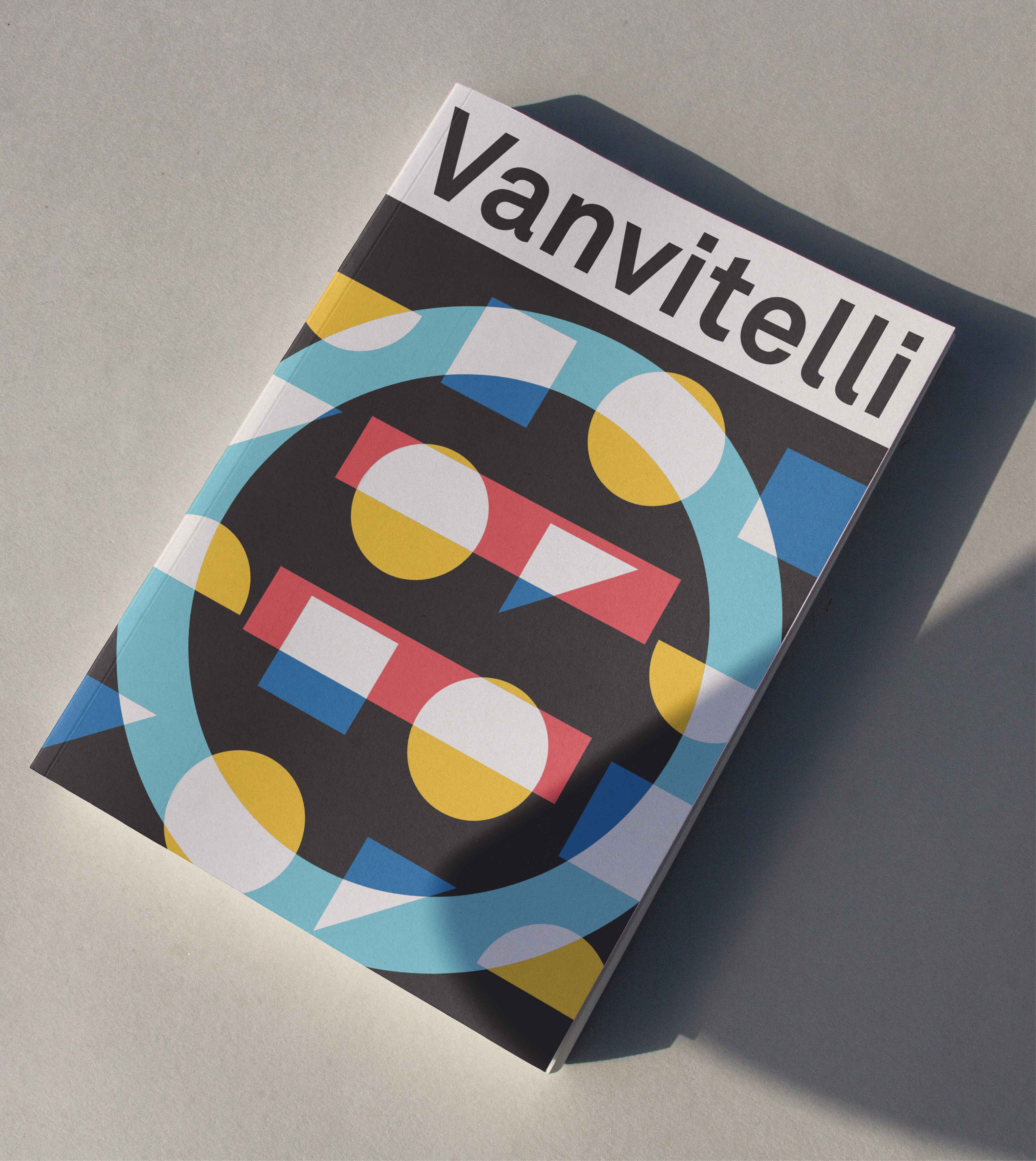
The logo design was built around the core values of knowledge exchange and inclusivity. To symbolize these ideas, the logo combines a circle and square, representing the integration of diverse disciplines and the balance between tradition and innovation. The circle evokes unity and connection, while the square introduces structure and stability. This combination reflects the University’s commitment to fostering open dialogue and collaboration across academic fields. In addition to the main logo, each individual department within the University is represented through a unique sub-identity. While each department’s logo follows the same visual structure as the main University mark, subtle differences are introduced in the intersections of the circle and square, with symbols that metaphorically represent the specific field of study. These symbols bring individuality to each department’s logo, while maintaining a cohesive and recognizable connection to the University’s central identity. This system allows each department to have its own distinct identity, while ensuring that it remains part of the larger, unified whole of the University. This strategic approach to branding reflects the University’s commitment to multidisciplinarity and fosters a sense of community across diverse academic disciplines. The design is simple yet versatile, ensuring it can be applied across various platforms and maintain its impact on both digital and print media. By embodying these principles, the logo and department-specific sub-identities serve as a visual testament to the University's commitment to progress, multidisciplinarity, and community-driven education.
MY ROLE
Art direction and design
DISCIPLINES
Branding, Visual Design, Editorial, Design System
YEAR
2017
ABOUT
Following the change of the University’s name from Seconda Università di Napoli (SUN) to Università degli Studi della Campania Luigi Vanvitelli, the Institution has decided to launch an international call for ideas to produce the graphic design of the mark and/or logotype and related visual identity system. The University was established in 1991 within a diffuse regional context, and since the very beginning it has been entirely autonomous from the other, older Universities for its history, culture, nature and organisation. The reasons behind the decision to go through a rebranding process lie in the strong will to highlight the University’s modern, highly dynamic nature by: stressing a shift of scale; highlighting the high reputation earned over time; setting the basis for a greater recognisability; reinforcing a renewed, contemporary identity.
CLIENT
Università degli Studi della Campania — Luigi Vanvitelli (Proposal)
DISCIPLINES
Branding, Visual Design, Editorial, Design System
YEAR
2017
© LR 2024
© LR 2024
© LR 2024
© LR 2024
© LR 2024